UTS: HELPS Booking System
GitHub Repo
We used NodeJS, NuxtJS, Vue & Vuetify
Overview
HELPS Booking System is an online web platform for UTS Helps Centre to organise its education services (workshops and consultations) for UTS students. Over the course of two semesters, Software Engineering Studio 2A and 2B, a team of myself and 10 students were in charged of rebuilding and re-envisioning a modernised version of the platform. The project has been divided into two the main components: 1) interviewing the stakeholders to better understand the client's need and create a feasible timeline according to the scope, and secondly, 2) to produce a functional MVP (minimum-viable-product).
Autumn Semester - Build user requirements and iterate the scope and wireframe the flow of user interactions
Spring Semester - Design all the components and build the full feature set of the website
Software Requirements
The team adopted the best agile development practices and engaged in weekly communication through Discord and collaboration with stakeholders to prioritise their needs within the platform.
For this project, I took the role of project designer and front-end developer to design all features correctly using my design philosophy and thinking to create a suitable application for our client’s specifications.
I took the initiative to map out all the features - even those that were not included within the scope of the MVP. This ensured that we did not look over any critical use cases of the application.
I created wireframes in Adobe XD with to animate the working prototype of how the application might look and feel. At each stakeholder meeting, I showcased the prototype and received constructive feedback to enhance the next iterative design further and so forth.
In addition, we asked the product owner to go through their current application processes as we did not receive approval from UTS to use the application ourselves. This proved valuable as there were many pain points the stakeholders had brought up that they would like to fix or change in the next version of the HELPS Booking System.
Design Principles
The current HELPS Booking System is an outdated platform with design cues reminiscent of legacy software using PHP and vanilla JavaScript (a lot of grids and tables and not many pleasant visual aspects).
We wanted the application experience to feel familiar and be semantic with all the other existing platforms used by UTS. UTS Library was used as the base of our design as it was an outdated system that was recently given a UI refresh.
I browsed through all of UTS’s website and branding guidelines to formulate a design principle that can be used as the basis of all the component’s UI.
User Interface
The majority of this project has been prototyped and wireframed using Adobe XD as it has great features such as commenting and sharing to accelerate collaboration. In the first semester, my designs were the first physical aspect of the project that our stakeholders and the team could visualise the application.
Artboards
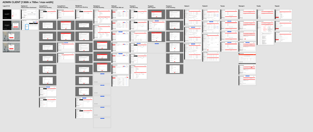
This was my third time using Adobe XD and I thought it would be great if I could animate the feature from step 1 to N. Over the weeks of creating the wireframes, I noticed that the more artboards I added - the more frequently XD would crash, and I would have to start over again. Sometimes, I would lose a whole day of progress because Adobe does not have autosave ability like the other applications I have used, like Photoshop and Illustrator.
Stylesheet
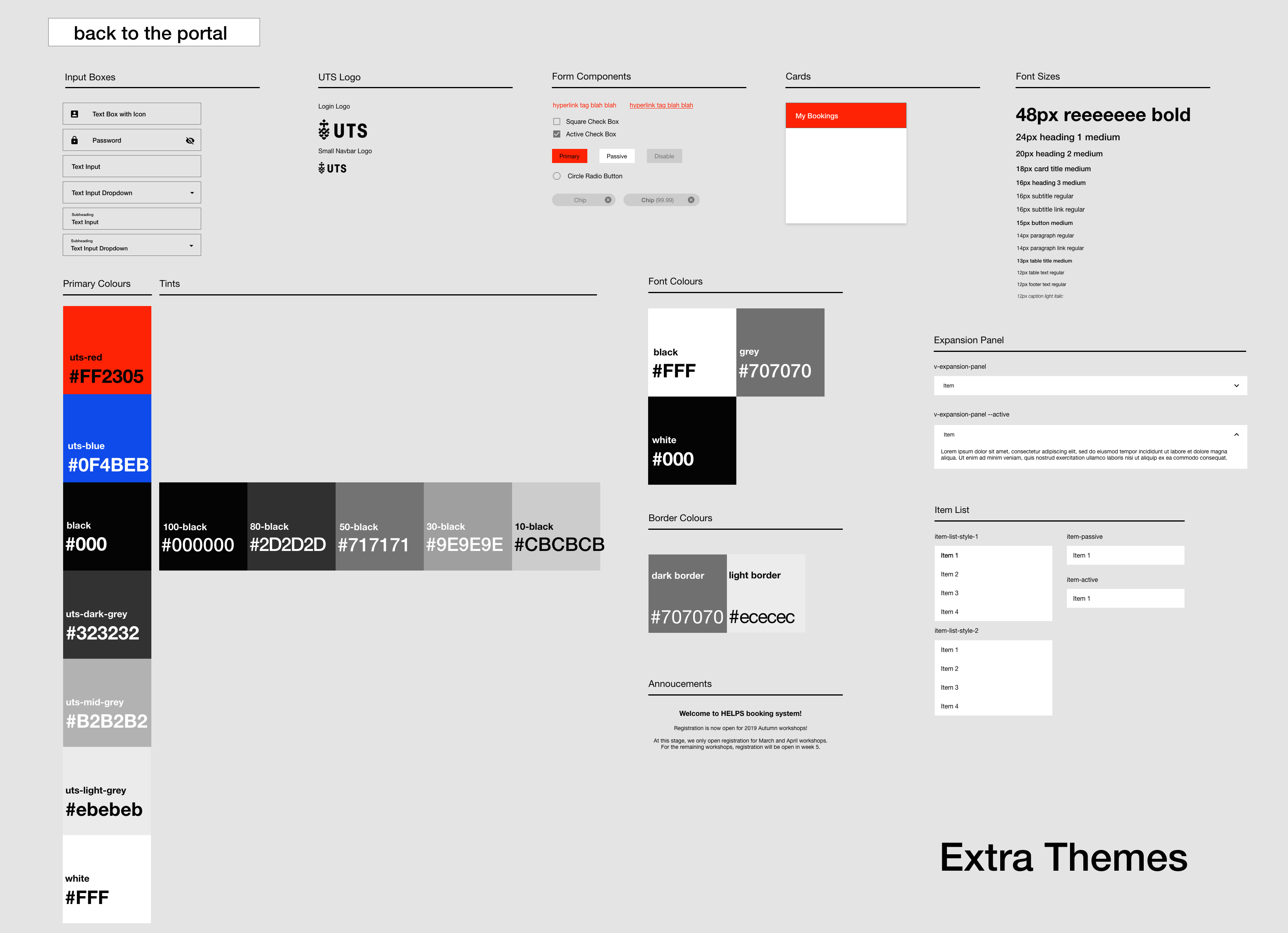
The stylesheet is a brief guideline of what components we would use within the Vuetify component library and designing our components. Another problem I had noticed in previous studios was that many students didn’t understand how standard sizes work, including but not limited to fonts, padding and margins. Designing the style sheet and the wireframes allowed me to show how I envisioned each component and keep consistency across different tasks completed by different team members.
Staff Interface - Desktop
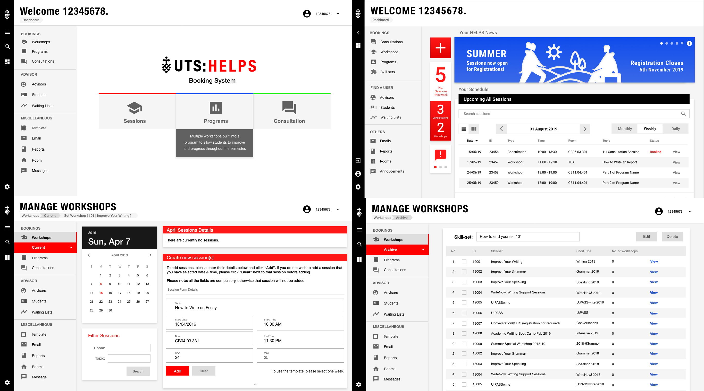
The staff and student views were planned to be designed differently as the staff view is curated by the functionality of completing tasks quicker and easier. The student interface was simplistic and minimalistic to make it easy to use and approachable by most of the students whose first language is not English.
Student Interface - Desktop
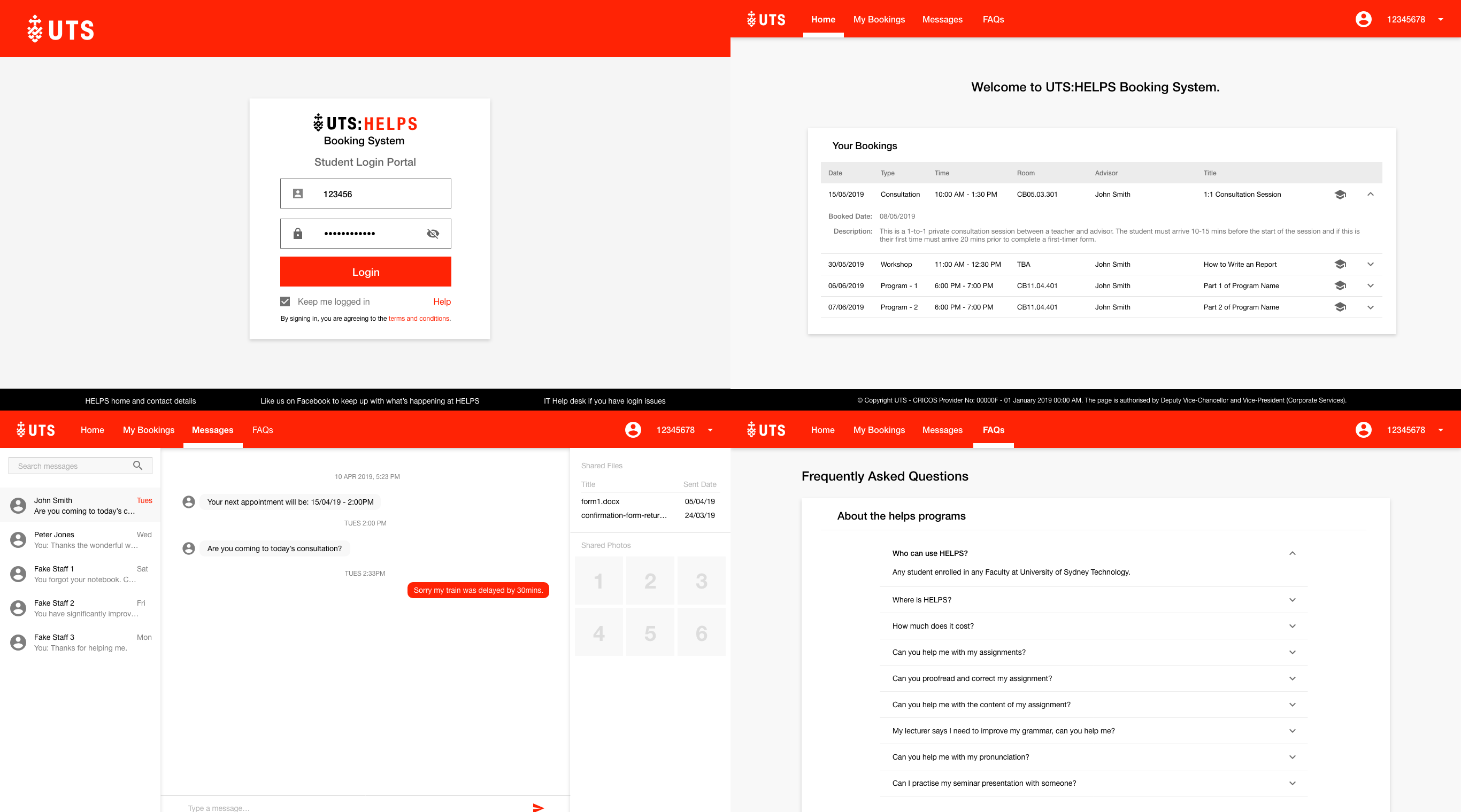
As you can see from the student interface, there is two version desktop and mobile.
We imagined that the user experience using this app would be simple and easy to use. This meant we only designed the critical features that a student would use - browsing for a session/workshop, booking a session and check-in. These were basic functionality of the MVP for the client interface.
Student Interface - Mobile
The mobile version was an out of scope feature. It would have required us to split the team into smaller groups to focus on this interface only to be used by students. The team thought we could wrap the ‘desktop interface’ into a ‘mobile version’ using Electron - similar to what many companies do with building native applications for all different types of the operating system using 1 codebase.
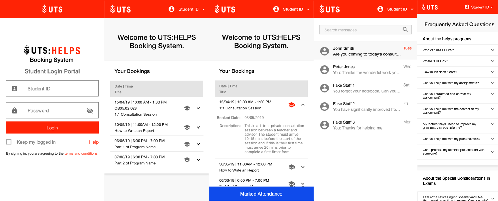
Ultimately, the mobile version’s main feature allowed students to check-in using a QR code. This provides HELPS team information to track which sessions are more popular than others and how they can further help the student after the class ends. This resulted in me creating mockups of a messaging platform akin to Messenger, Telegram or Signal. Having a personal inbox would help facilitate an environment that gives more confidence to students to have 1-on-1 time outside of class time. The messaging feature has a complete suite of tools, such as a commenting system that allows users to collaborate closely by drawing on top of pictures simultaneously. This rich feature set with its high coding complexity was why this was put in the out-of-scope section.
Take Aways
We achieved full marks for the assignment portion of Software Engineering Studio 2A and 2B through our hard work and dedication, contributing to my almost perfect score for both subjects.
This project was highly ambitious; however, it helped exponentially increase my ability to prototype and wireframe with user requirements.